STAY WILD
Anton
Bold condensed sans
Streetwear, gym and slogan tees. Tall, heavy and easy to read from across a room.
Type your slogan below and see it in 16 free t-shirt fonts on a shirt color of your choice. Then use the guide to pick a font that prints cleanly, sits at the right size and is safe to sell.
Type your words, pick a shirt color and compare. Every font here is a free Google Font under the Open Font License, so you can print it on shirts you sell.
Up to 30 characters. Short slogans print best.
Bold condensed sans
Streetwear, gym and slogan tees. Tall, heavy and easy to read from across a room.
Condensed all-caps sans
Clean, modern headlines and left-chest wordmarks. Capitals only.
Condensed sans
Sport, workwear and outdoor looks. Works in two lines, stacked.
Heavy grotesque sans
Big front prints with few words. Thick strokes suit screen print and puff.
Geometric sans
Minimal brand tees and sub-lines. Safe, clean and very readable.
Heavy slab serif
Retro, diner and vintage-poster looks. Chunky serifs survive printing.
Varsity slab
College, team and school-style tees. Pairs well with numbers.
Signage display
Urban, neon-sign and street-sign looks. Strong at large sizes.
Stencil display
Military, gaming and tough-guy graphics. Stencil gaps look intentional.
Rounded retro display
Friendly 70s and surf looks. Round shapes are forgiving in print.
Marker handwriting
Casual, hand-made and skate-style slogans. Keep the line short.
Brush script
Beach, cafe and feminine looks. Needs a thick weight and a large size.
Bold script
Retro logos and signature phrases. Better than most scripts at small sizes.
High-contrast serif
Premium, editorial and quote tees. Thin hairlines need DTG or a good print shop.
Blackletter
Metal, tattoo and gothic streetwear. Use big and keep the text very short.
Inline neon display
Disco and neon looks. Thin inline cuts fail in screen print and puff: use DTG or DTF, large only.
The preview is a screen preview, not a print proof. Real ink, fabric and print method change how thin parts of a letter look.
A shirt is read from two or three steps away, on a moving person, on fabric that is not flat. The best t-shirt fonts are the ones that stay clear under those conditions, not the ones that look best on a screen.
Each print method has a limit on how fine a letter can be. These are typical rules of thumb. Your printer can tell you its exact minimums, so ask before you finalize artwork.
| Print method | Typical limit for text | Fonts to avoid |
|---|---|---|
| Screen print | Strokes of about 1 pt (0.35 mm) can work; 2 pt or thicker is safer. Very small text can fill in. | Hairline serifs, tiny script, distressed fonts with micro-specks |
| Puff print | Strokes thicker than about 3 mm (1/8 inch) and no small text, because the ink spreads as it rises. | Scripts, thin or inline fonts, tight letter spacing |
| Embroidery | Letters usually need to be roughly 6 mm (1/4 inch) tall or more, with thicker strokes. | Thin serifs, tiny text, fonts with very small gaps |
| DTG and DTF | Handles fine detail best, but hairlines under about 1 pt can look weak on textured fabric. | Ultra-thin weights |
| Heat transfer vinyl | Needs shapes you can cut and weed by hand. Thin strokes and small counters are slow and break. | Detailed scripts and small text |
If you are not sure, choose a heavier weight of the same font. A bold or black weight survives almost every method.
Size depends on where the print sits. These widths are typical for adult sizes (S to XL). Large and small sizes need scaling, and your print shop may have its own maximum.
| Placement | Typical print width | Font advice |
|---|---|---|
| Full front (chest) | 10 to 12 inches wide, starting about 3 to 4 inches below the collar | Bold or display fonts; one to three short lines |
| Oversized front | 12 to 14 inches wide | Heavy condensed or blocky fonts, very short phrase |
| Left chest | 3 to 4 inches wide | Simple sans or slab, no thin lines, 2 words at most |
| Full back | 10 to 14 inches wide | Anything that reads from far away; good for a long slogan or a name and number |
| Back neck (below collar) | 2 to 4 inches wide | Short brand name in a clean, bold font |
| Sleeve | 2 to 4 inches wide | Heavy sans, one word or a short logo |
A simple test before you order: print your artwork at real size on paper, hold it against a shirt and step back about 2 meters (6 feet). If you cannot read it, make it bigger or choose a bolder font.
All 16 fonts in the previewer are on Google Fonts and are released under the SIL Open Font License (OFL). That license lets you use the fonts for commercial work, including printing them on products you sell, without paying or crediting the designer. You may not sell the font files on their own.
Fonts from other sources are different. Many free-looking fonts on download sites are free for personal use only. Commercial use needs a paid license, and some licenses charge by the number of products or sales. Read the license file that comes with the font and keep a copy.
Never copy the lettering of a brand, a band, a sports team or a movie, even if the font is similar. A famous logo is a trademark. Use your own words and a licensed font.
This is general information, not legal advice. If you build a brand on a paid font or a custom logo, confirm the license terms in writing.
Once you have picked a font, put your slogan on a mockup to check the whole look before you order samples. Need words first? The slogan generator gives you ideas, and the brand name generator helps with the name on your tag. If you are still planning the business, the t-shirt business guide covers costs and print methods.
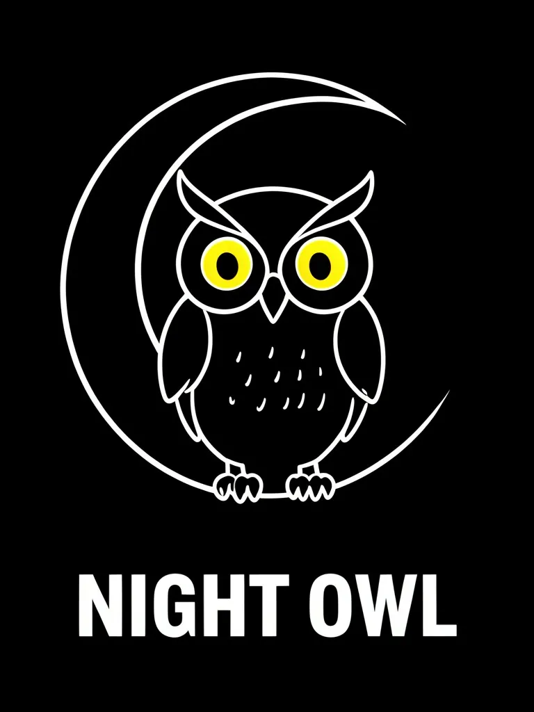
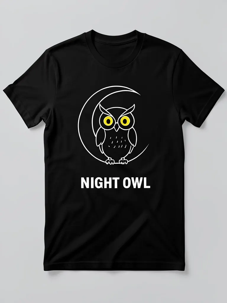
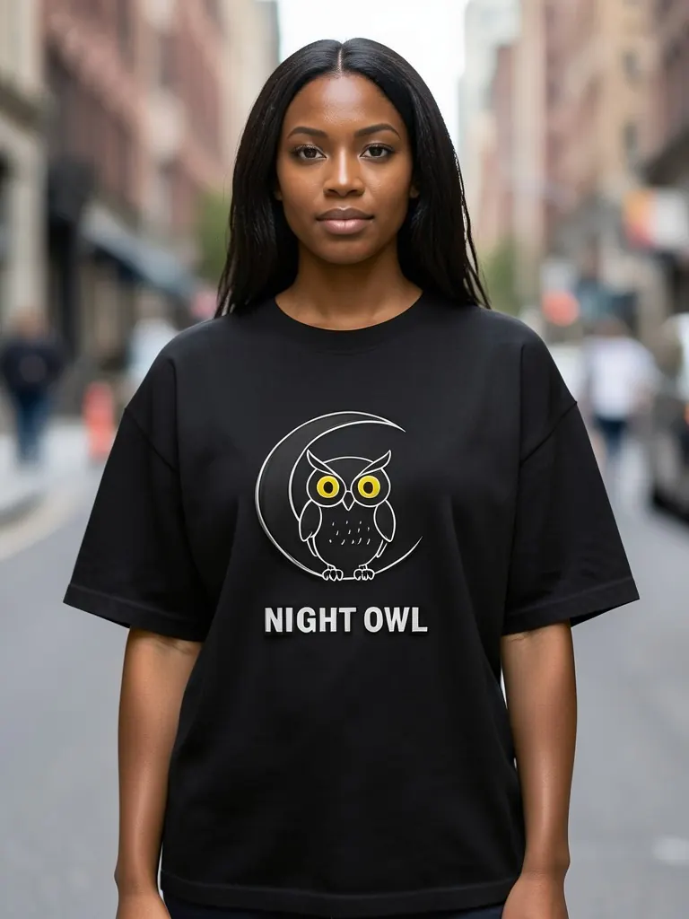
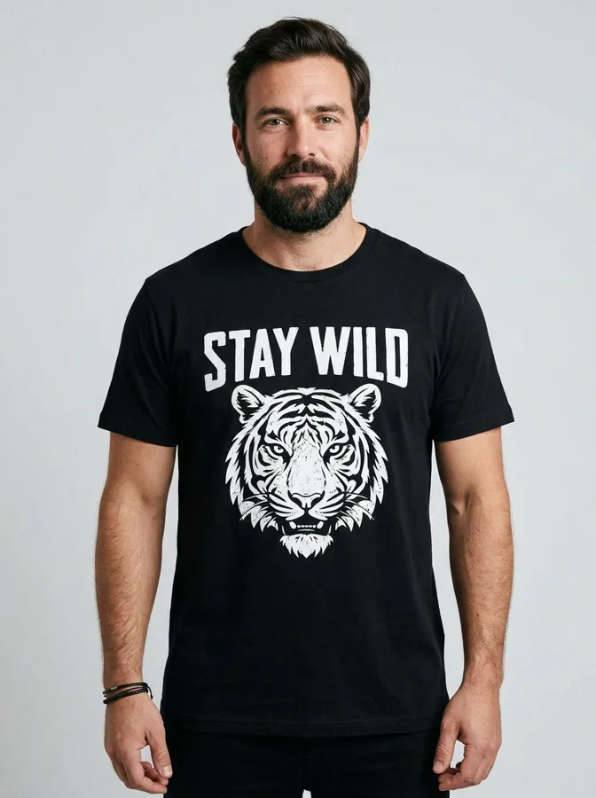
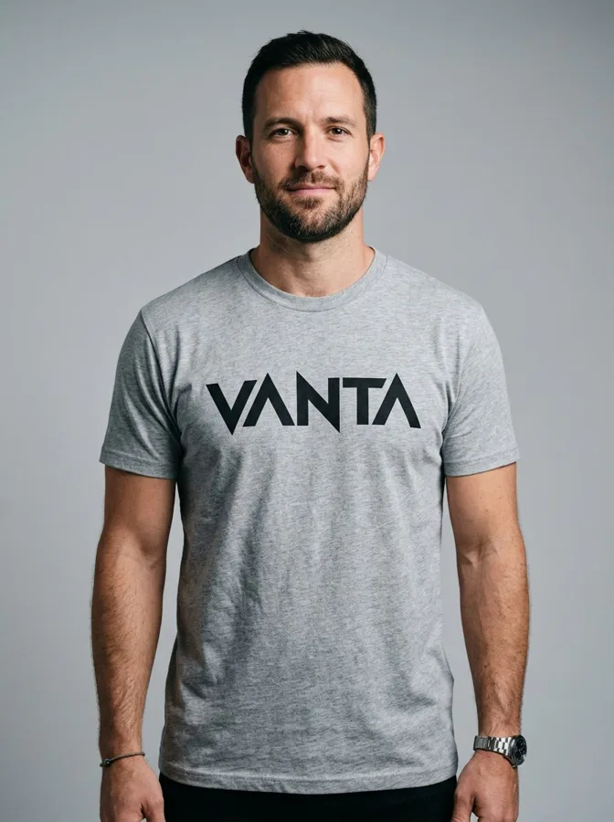
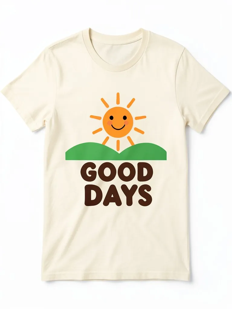
There is no single best font, but heavy, wide and simple fonts such as Anton, Archivo Black and Montserrat ExtraBold are safe choices because they stay readable from a distance and print cleanly. Match the font to your style and test it at real size.
One or two. Use one main font for the key words and, if needed, a quiet second font for a small line. Three or more fonts usually look cluttered and are harder to print well.
Yes. Google Fonts are released under open licenses, mostly the SIL Open Font License, which allows commercial use, including printing the text on products you sell. You cannot resell the font files themselves. Fonts from other free-font sites often have different rules, so check each license.
A left-chest print is usually about 3 to 4 inches wide, so use a bold, simple font with no thin lines. A full-front print is usually 10 to 12 inches wide, so the text can be much larger. Print your artwork at real size on paper to check.
Avoid hairline serifs, very thin scripts, tiny text and fonts with micro-specks or very thin inline cuts. They fill in or break up on fabric. Heavier weights of the same fonts are usually fine.
Close, but not identical. The preview is a screen preview. Ink spread, fabric texture and the print method can make thin strokes look lighter or heavier. Ask your printer for a sample or proof for a new design.
Print limits and sizes are typical rules of thumb and vary by printer. Check your print provider for exact requirements.
Show your print or logo on blank apparel, hats, bags and tags before you make it.